Radio Button
Use radio button to display each item in a list of options, where marketers have to make a single choice.
Default
<div class="e-field">
  <label class="e-field__label">
    Clear group label
  </label>
  <ul class="e-list">
    <li class="e-list__item">
      <input class="e-radio" type="radio" name="chb1" id="chb1.1" checked>
      <label for="chb1.1">
        Radio label
      </label>
    </li>
    <li class="e-list__item">
      <input class="e-radio" type="radio" name="chb1" id="chb1.2">
      <label for="chb1.2">
        Radio label
      </label>
    </li>
  </ul>
</div>
<div class="e-field"><label class="e-field__label">Clear group label</label><ul class="e-list"><li class="e-list__item"><input class="e-radio" type="radio" name="chb1" id="chb1.1" checked><label for="chb1.1">Radio label</label></li><li class="e-list__item"><input class="e-radio" type="radio" name="chb1" id="chb1.2"><label for="chb1.2">Radio label</label></li></ul></div>Variations
Disabled
<div class="e-field">
  <label class="e-field__label">
    Clear group label
  </label>
  <ul class="e-list">
    <li class="e-list__item">
      <input class="e-radio" type="radio" name="chb2" id="chb2.1" checked disabled>
      <label for="chb2.1">
        Radio label
      </label>
    </li>
    <li class="e-list__item">
      <input class="e-radio" type="radio" name="chb2" id="chb2.2" disabled>
      <label for="chb2.2">
        Radio label
      </label>
    </li>
  </ul>
</div>
<div class="e-field"><label class="e-field__label">Clear group label</label><ul class="e-list"><li class="e-list__item"><input class="e-radio" type="radio" name="chb2" id="chb2.1" checked disabled><label for="chb2.1">Radio label</label></li><li class="e-list__item"><input class="e-radio" type="radio" name="chb2" id="chb2.2" disabled><label for="chb2.2">Radio label</label></li></ul></div>Error
<div class="e-field">
  <label class="e-field__label">
    Clear group label
  </label>
  <ul class="e-list">
    <li class="e-list__item">
      <input class="e-radio e-input-error" type="radio" name="chb3" id="chb3.1" checked>
      <label for="chb3.1">
        Radio label
      </label>
    </li>
    <li class="e-list__item">
      <input class="e-radio" type="radio" name="chb3" id="chb3.2">
      <label for="chb3.2">
        Radio label
      </label>
    </li>
  </ul>
</div>
<div class="e-field"><label class="e-field__label">Clear group label</label><ul class="e-list"><li class="e-list__item"><input class="e-radio e-input-error" type="radio" name="chb3" id="chb3.1" checked><label for="chb3.1">Radio label</label></li><li class="e-list__item"><input class="e-radio" type="radio" name="chb3" id="chb3.2"><label for="chb3.2">Radio label</label></li></ul></div>Block
<div class="e-row">
  <div class="e-col-3">
    <div class="e-field">
      <label class="e-field__label">
        Clear group label
      </label>
      <ul class="e-list">
        <li class="e-list__item">
          <input class="e-radio e-radio-block" type="radio" name="chb4" id="chb4.1" checked>
          <label for="chb4.1">
            Block label Block label Block label Block label Block label Block label
          </label>
        </li>
        <li class="e-list__item">
          <input class="e-radio" type="radio" name="chb4" id="chb4.2">
          <label for="chb4.2">
            Normal label Normal label Normal label Normal label Normal label Normal
          </label>
        </li>
      </ul>
    </div>
  </div>
</div>
<div class="e-row"><div class="e-col-3"><div class="e-field"><label class="e-field__label">Clear group label</label><ul class="e-list"><li class="e-list__item"><input class="e-radio e-radio-block" type="radio" name="chb4" id="chb4.1" checked><label for="chb4.1">Block label Block label Block label Block label Block label Block label</label></li><li class="e-list__item"><input class="e-radio" type="radio" name="chb4" id="chb4.2"><label for="chb4.2">Normal label Normal label Normal label Normal label Normal label Normal</label></li></ul></div></div></div>Related components
CheckboxSwitchButton radioRadio Button
Use radio button to display each item in a list of options, where marketers have to make a single choice.
Structure
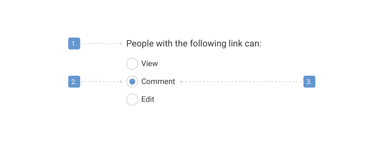
- Radio Button group label
- Interaction field
- Radio Button label
Best practices
Radio buttons should:
- Let the user select only one choice from a list of options.
- Be aligned vertically, because it clarifies the connection between the options but separates the items visually.
- Have their labels positioned on the right side of the selectors.
- Let users select an option by clicking on either the button itself or its label.
- Have a clear group label that describes what the selection is about.
- Be clearly labelled with a few words in a single line of text. The users should never wonder what the choices mean.
- Have less than 8 options. If you have more options, or the list of options might increase dynamically with time, consider using a Select component instead to avoid screen clutter.
- Be sorted the way to follow an intended logic, like
- Most frequently used to least frequently used
- Least to most risk
- Least to most effort or cost
- Optimally have a default choice that would fit the most frequent use case. If there is a default option, it should be the first on the list.
- Form a meaningful sentence when reading together the label and the selected item.
- Activate an error message under the radio field if no option is selected from a mandatory radio button list.
- Expose its effect only after validation. There are components that trigger real-time actions.
Try to avoid:
- Sorting items in alphabetical order. It couldn’t be localized due to its language-dependency.
- Large number of options. Use Select component instead.
- Overlapping choices. e.g. Age of contacts: 0-18, 18-35 - Where will be 18 years olds sorted?
- Horizontally aligned items, because they can make the affiliation of buttons and labels indistinct.
- Using Radio Button for triggering action.
- For selecting between two items, like on/off. Consider using the Switch component instead.
Content Guidelines
Radio Button labels
Radio Button labels should:
- Start with a capital letter.
- Not end in punctuation unless it consists of multiple sentences.