Dashboard Layout
Overview
Use dashboards to display various widgets on a screen to provide an overview of what the product is doing and how much value it is making for the customer, as well as highlighting any errors or missed opportunities.
Dashboard principles
The dashboard answers these questions:
- Am I getting a return on my marketing investment (ROI) through this product?
- Is it working properly right now? Do I need to fix anything?
- Am I using it to the best advantage? Are there any tips to help me improve? What features am I not using?
- What is my potential reach with this product, and how many of my customers am I actually reaching?
- What features are currently running?
- What is my current top performer of the day (Dynamic Delighter)?
Best practices
Dashboards should:
- Always be the landing page of a product.
- Contain two symmetric columns: a full-width widget takes up both columns, and a half-width widget that takes up just one column.
- Be arranged in a grid with each row featuring widgets of the same height.
- Provide a way to users to rearrange widgets as they wish, and automatically save their settings.
- Have a title that follows this naming convention: [Product Name] Dashboard
- e.g. Predict Dashboard, Triggered Email Dashboard.
- Use ‘Dashboard’ only for the main Dashboard.
Try to avoid:
- Having a dashboard accessible only through a sub-menu.
- Communicating information, meaning or context through the layout and positioning of the widgets. [See principle: A widget should be understandable on its own]
- e.g. Try to avoid creating a widget that only makes sense if it’s at the bottom of the dashboard.
- Creating a dashboard with 3 or more columns.
- Creating a dashboard with asymmetric columns.
- Putting widgets with uneven height next to each other.
- Having a single half-width widget in the last row when having an odd number of widgets.
- Consider making one of them into a full-width widget – only if it makes sense.
- Consider omitting one of the widgets, if possible.
- Consider merging two widgets, if possible.
- Never invent unnecessary widgets just to fill space.
- Having less than 4 widgets in a dashboard, so that the dashboard would not appear to be empty or half-complete.
Dashboard Widget
Overview
Use a dashboard widget to display insightful knowledge about a given part of the product or feature on the product dashboard.
Widget principles
When designing a widget, follow these principles:
- One widget should serve one definitive goal:
- Don’t cram multiple goals in one widget.
- Should make different widgets for multiple, different goals.
- A widget should be understandable on its own:
- Don’t make a widget dependant on information outside itself.
- Should be independent from the dashboard itself — so that we can use widgets in multiple dashboards.
- Should display the time range of the widget’s content.
- The data in the widget should be easy to understand:
- Don’t include so much data in the widget that it’s not easily scannable.
- Don’t use terms and metrics that are not present in the product it refers to.
- Should contain the fundamental knowledge — not more, not less.
- Data in the widget should reflect on any of the followings
- Performance metrics
- Product value
- Health check, system status, leverage
- A widget should lead somewhere:
- Don’t make a widget with no actionables.
- Should contain a follow-up action — to provide more details about the knowledge in the widget, to make a related action. (e.g. More details, settings, history, adding new items, etc.)
- A widget should provide knowledge, not simply raw data:
- Don’t just dump data into the widget.
- Should display data which give insights.
- Should display data in a way that supports understanding, instead of just listing information.
- A widget should be visual:
- Don’t make a text-heavy widget.
- Should use charts and diagrams to visualize data. See [Reporting principles] on how to present data.
- A widget should never be blank:
- Don’t display “empty content” (e.g. empty charts, zeroes everywhere) for widgets with unused features.
- Should have an empty state explaining what information would go here, why it’s not present (e.g. a feature is not in use) and what are the necessary steps to activate it. See Emptystate guidelines
- Consider hiding an empty widget completely if there’s no point in displaying an empty state for it (e.g. for upselling, broadcasting).
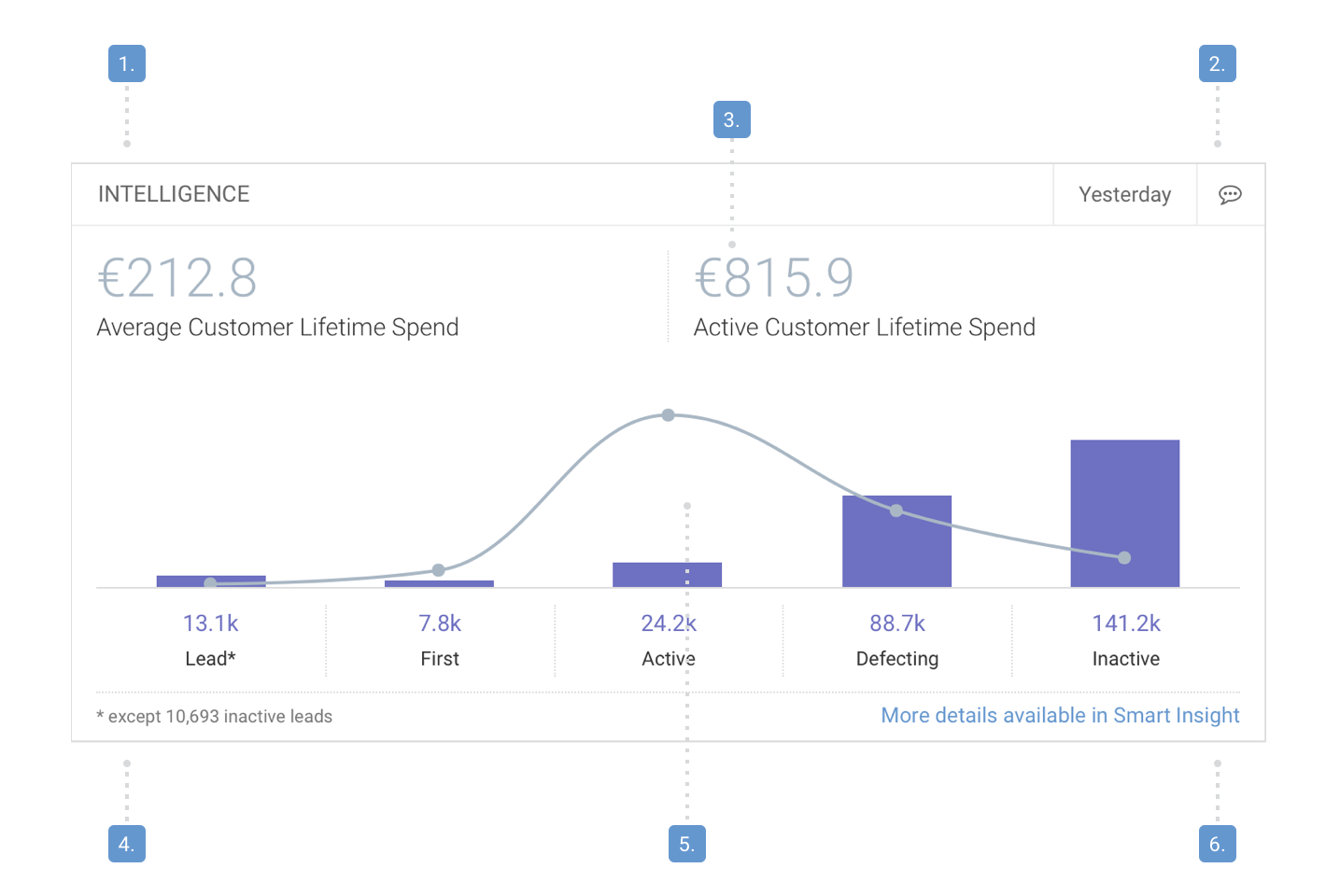
Structure
- Widget title
- Widget settings
- Widget metrics (optional)
- Widget footnotes (optional)
- Widget content
- Widget follow-up actions
Best practices
Widget title
Widget titles should:
- Be as short as possible.
- Properly describe the widget even if it’s not in a dashboard [See: A widget should be understandable on its own].
Try to avoid:
- Using generic terms on their own (e.g. Results, Summary, Overview).
- Bad: “Results”, Good: “Campaign Results”.
- Using terms that are not present anywhere in the product it refers to.
Widget settings
Widget settings should:
- Be placed in the right side of the title bar.
- Include time range selection and filtering options.
- Include a simple time range selector
- Time range selector should have fixed options: 7, 30, 60, 90 days.
- If a widget doesn’t have a selectable time range, the used time range should still be displayed: today, yesterday, last 30 days, live, etc.
Widget metrics (optional)
Widget metrics should:
- Have the highest prominence in the widget, with their meaning below. A breakdown of the total may be provided below that.
- Indicate trends for a given metric
- E.g. open rate for emails — growing or declining
- Contain big numbers and a legend to decribe the meaning of the metric.
- For very complex metrics consider defining a shorter title and explain the full meaning in a tooltip.
- Use big numbers to display summarised data, or data in a point of time.
- Big numbers should be abbreviated: instead of 1000, use 1k, and instead of 1 000 000 (or 1 000 k), use 1M.
- Don’t use B to avoid confusion, use M as the biggest step (Also B might cover the real magnitude of very large numbers.)
- Don’t abbreviate percentages.
- Always display the currency symbol when money is represented.
- See existing libs:
Widget content
Widget content should:
- Mix data visualization (charts) and metrics (numbers).
- Use charts to display data over time.
- Show relevant details about a point in the charts when hovering over it.
- Feature multiple graphs and widget metrics to display different metrics for the same product or feature.
- All graphs within a widget should display data in the same time range that is set in the widget.
- Feature multiple tabs to separate different set of metrics for the same product or feature see Tab guidelines
- In widgets, tab labels can contain metrics, not just titles.
- Use colors that connect metrics and charts [See: Reporting principles]
- Try to use different colors or color ranges within one dashboard to better separate widgets.
- Colors should be consistent within a product, but not necessarily across the whole Emarsys Suite.
Try to avoid:
- Merging multiple widgets into one widget by using tabs [See principle: One widget should serve one definitive goal]
- Using footnotes
- Use charts and legend to describe content or display further details in the first place.
- Footnotes should be small static texts in the bottom left corner of the widget.
- Consider using inline tooltips instead of footnotes.
Widget follow-up actions
Widget follow-up actions should
- Be used for all widget. [See principle: A widget should lead somewhere]
- Be placed at the bottom of the widget in form of a CTA button.
- Follow copywriting guidelines accordingly.
Try to avoid:
- Having no more than two follow-up actions [See principle: One widget should serve one definitive goal]